Online Banking
19/03/2025
Empowering Financial Growth
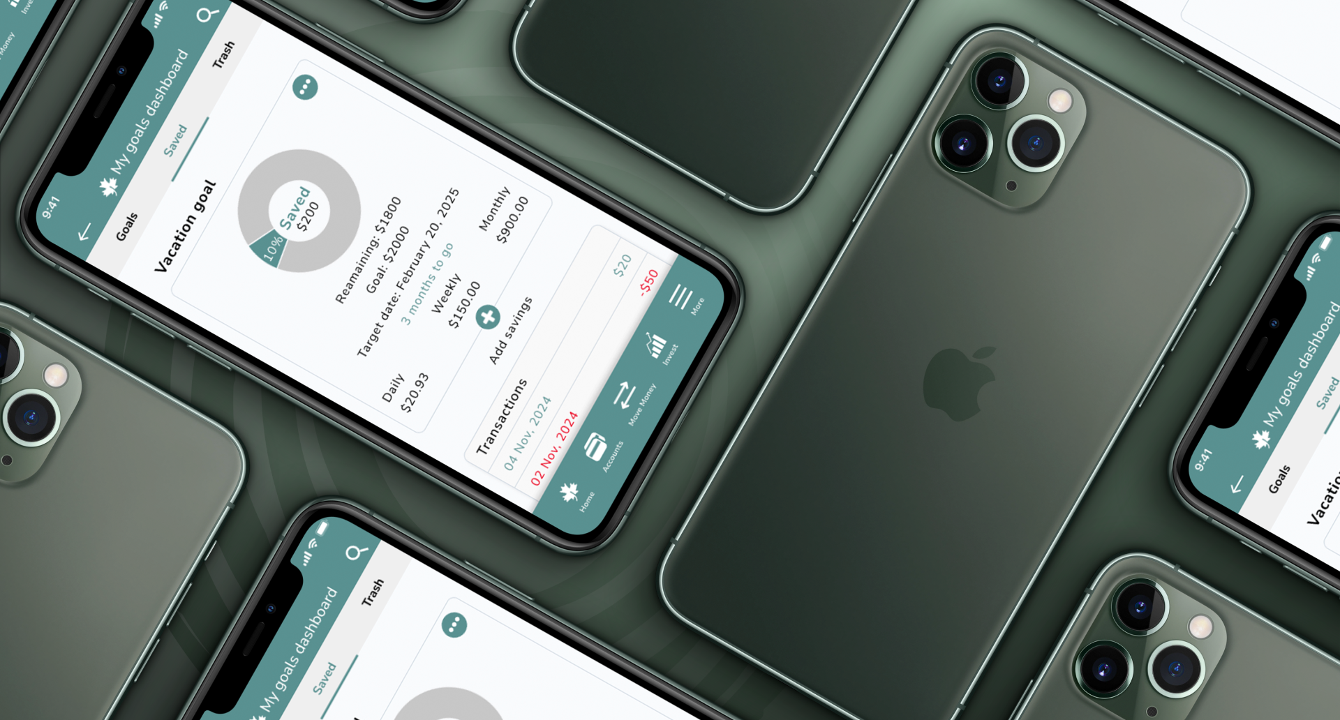
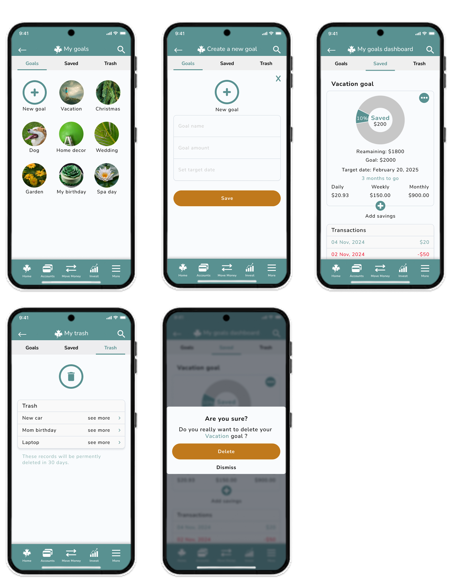
Final design of the Maple Bank app in a Photoshop mockup, showcasing the “Savings Goal” screens, with new features, all aligned with the updated design system.
SITUATION
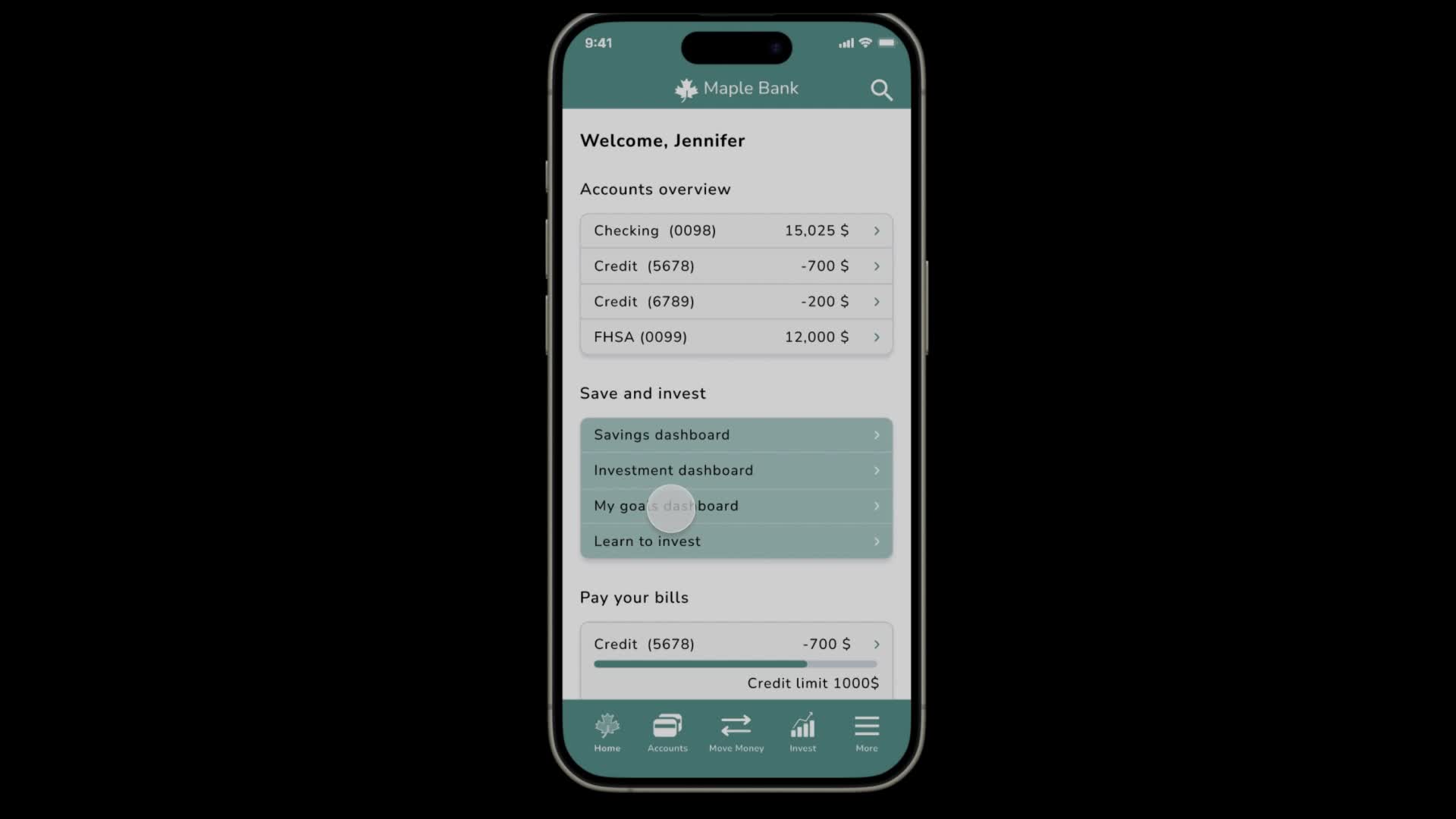
Maple Bank is a digital-first institution catering to young professionals, students, and families. It provides simple, affordable, and accessible financial services, including chequing and savings accounts, credit, investments, and insurance. With a user-friendly mobile and web platform, Maple Bank empowers modern customers to bank effortlessly and conveniently. GOAL The goal of this project is to redesign the Maple Bank mobile app to enhance onboarding and financial education. Key additions include the "Learn to Invest" module, the "Savings Goal" tool, and an engaging onboarding journey. These features aim to empower users to manage finances confidently, learn investing, and achieve financial goals, all through a simple and intuitive interface. This redesign seeks to boost user engagement, improve retention, and strengthen Maple Bank's appeal to young individuals and families. PROBLEM STATEMENT Maple Bank’s primary customers—young professionals, students, and families—need a simple, engaging digital banking app to support their financial growth. The current app lacks educational content, personalized investment tools, and intuitive navigation, making it harder to retain users seeking more than basic services. Users also need an easy way to understand investments and set achievable savings goals without feeling overwhelmed. DESIGN CONSIDERATIONS User centered design - focus on a simple, intuitive interface for young professionals, students, and families, with options for personalization. Consistent branding - Use Maple Bank's branding colors, modern fonts, and growth-oriented imagery for a cohesive brand experience. Simple ease of use - Ensure easy navigation, clear visual hierarchy, and break complex topics into simple steps for better accessibility. Onboarding - Create engaging onboarding screens to highlight key features and use badges and progress markers to encourage user engagement. Information architecture - Structure the "Learn to Invest" section with organized tabs and filtering options, supported by clear navigation elements like back buttons. Interactive learning - Implement interactive elements like quizzes, progress tracking, and simulations to make the learning experience engaging and rewarding.

TASK
This project aims to enhance the Maple Bank app by improving onboarding, integrating the "Learn to Invest" module, and adding a "Savings Goal" feature. These improvements will empower users to achieve their financial goals with greater ease, boost engagement, and position Maple Bank as a leading digital banking solution. RESEARCH The research focused on understanding young professionals, students, and families to design a user-centered digital banking experience. User interviews revealed challenges in managing finances and investing, while competitor analysis (Tangerine, Wealthsimple, Simplii Financial) identified opportunities in investment education and onboarding. Customer feedback highlighted pain points like limited investment options and learning resources. User personas and journey mapping clarified friction points, and industry trends inspired features like the "Learn to Invest" section. KEY INSIGHTS: - Users want accessible investment education - A combined solution for banking, saving, and learning is desired - Simplified navigation is essential for a positive user experience

━
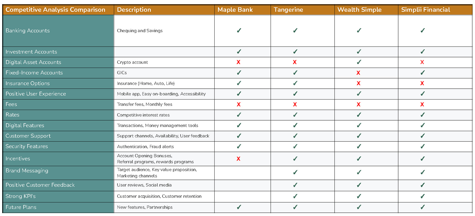
Jennifer Lee - 35, is a teacher saving for a down payment. She needs a simple, beginner-friendly app to grow her savings confidently. SCENARIO Jennifer is determined to save for her dream home but finds it challenging to manage her finances effectively. While she understands basic budgeting, the idea of investing her savings to grow her funds feels overwhelming. GOALS - Helps her visualize her financial progress toward her down payment goal - Provides straightforward and beginner-friendly investment options - Offers tools like automated savings plans and spending insights to help her stay disciplined - Builds her confidence with simple, educational content about personal finance FRUSTRATIONS - Feels overwhelmed by complex investment terms and processes - Doesn't know where to start with saving and investing effectively - Finds many banking and budgeting apps too cluttered or difficult to use - Gets frustrated when financial apps assume users already understand investments COMPETITIVE ANALYSIS COMPARISON - Strengths: Comprehensive product offerings and strong customer support - Areas for Improvement: Expand incentives and introduce digital asset accounts - Opportunities: Improve brand messaging and customer incentives to stay competitive

ACTION
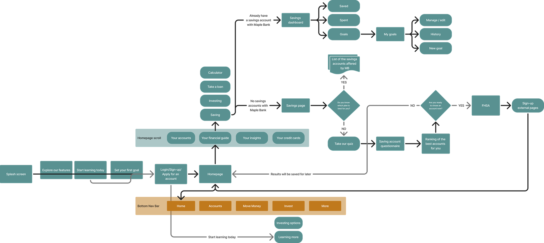
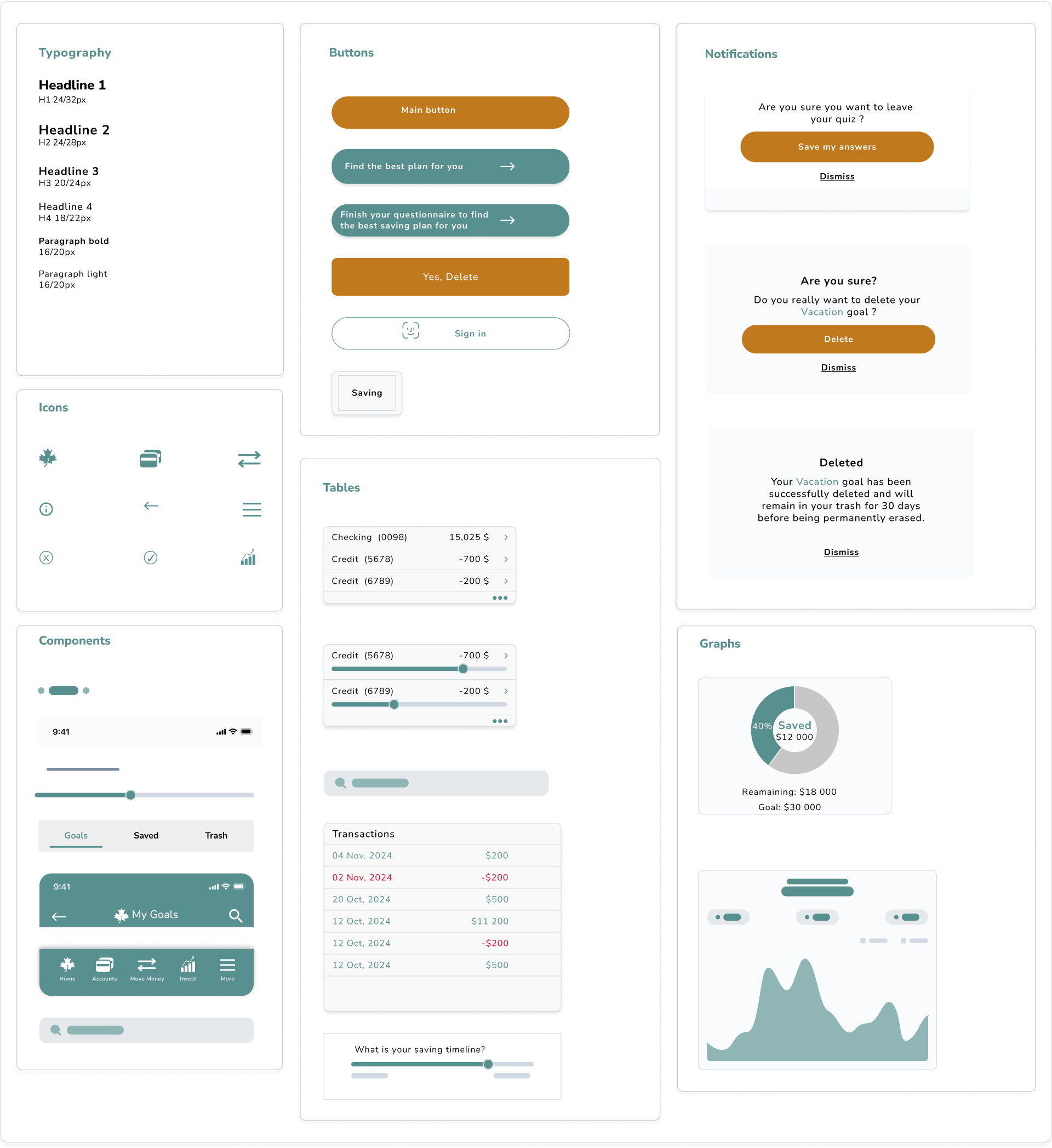
Using gathered insights, we designed a user flow to ensure a seamless journey from onboarding to savings and investment education. A design system was developed for consistency, covering colors, typography, and UI components.
━
DESIGN SYSTEM Next, we created low-fidelity wireframes to outline solutions, focusing on an engaging onboarding flow. This included key app features, clear CTAs, and progress markers to enhance user engagement and ensure a smooth experience.
━
TYPOGRAPHY Nunito is the chosen brand font for Maple Bank's app redesign. It was selected for its modern, friendly, and approachable characteristics, which align well with Maple Bank's goal to appeal to young professionals, students, and families.

━
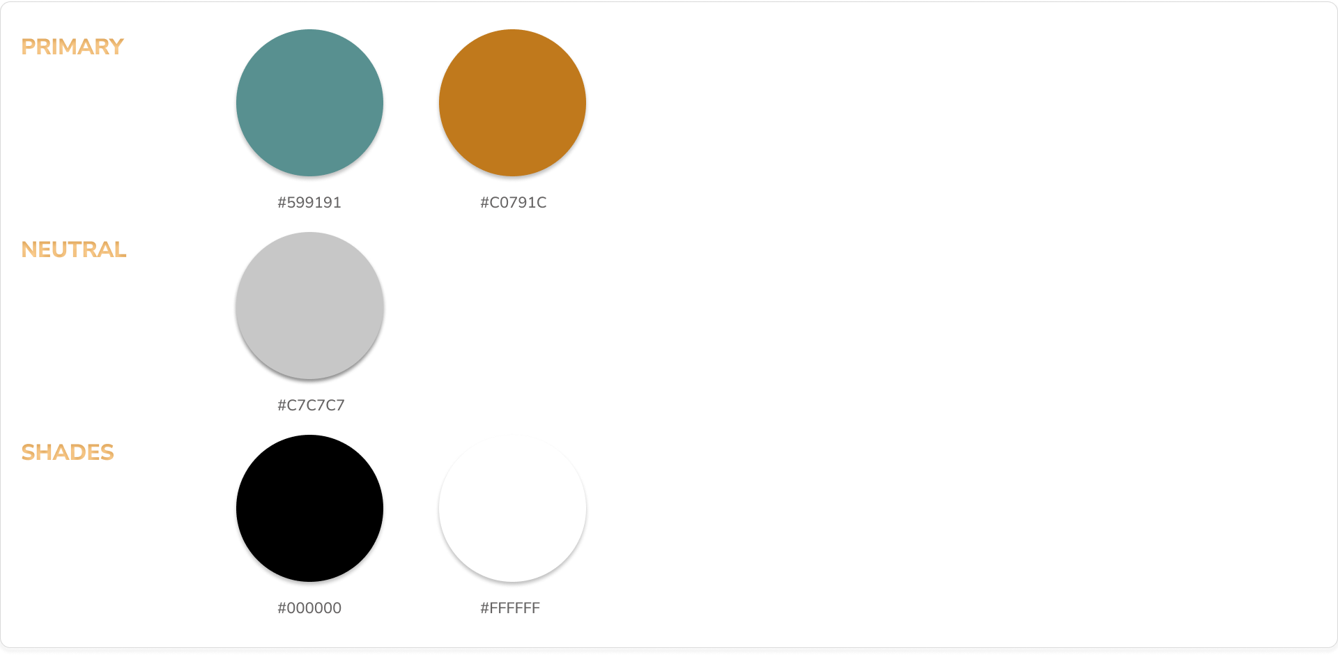
COLOURS - Maple Bank’s colour palette was carefully selected to reflect the brand’s values of trust, growth, and simplicity. - Primary Colours: Soft greens and gold are used as primary brand colours. These shades convey stability and reliability, which are crucial in building trust with our users. - Accent Colours: Bright accent colours are used for call-to-action buttons and key elements to drive engagement and guide users intuitively through the app experience. - Accessibility: Colours have been chosen with high contrast in mind to ensure accessibility and create a seamless experience for all users, including those with visual impairments.
━
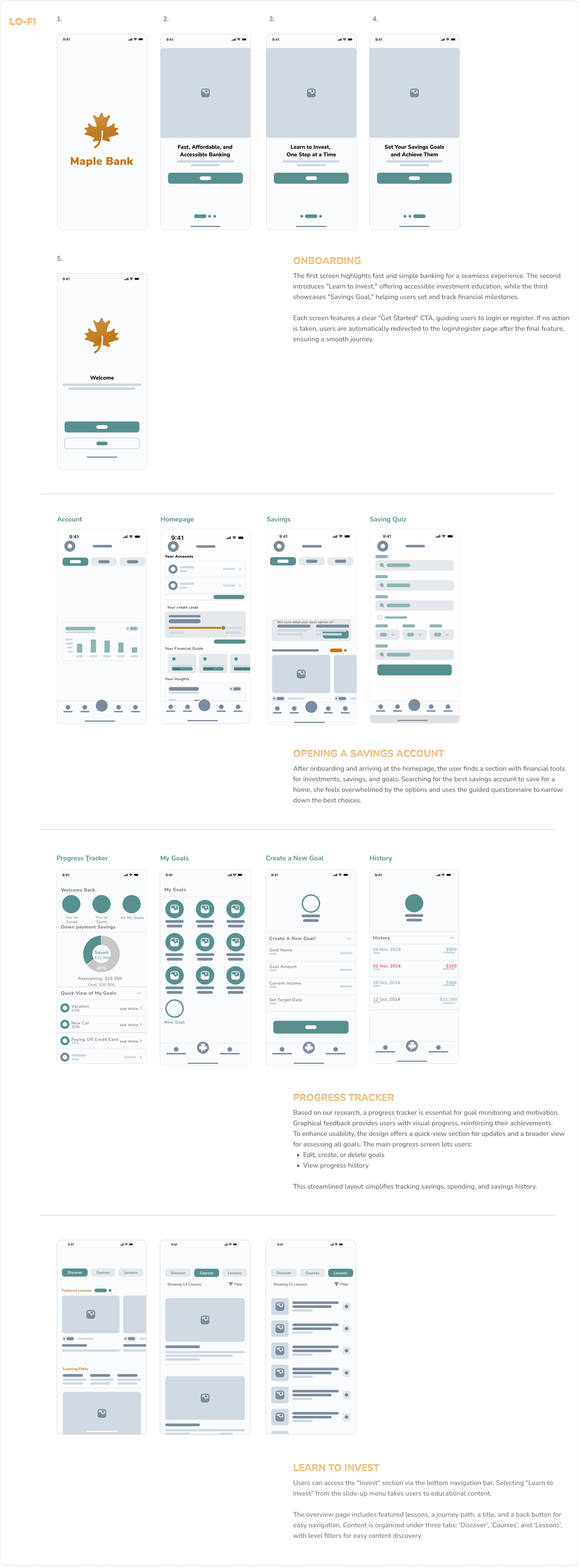
WIREFRAMES We started with low-fidelity wireframes to explore layout ideas and validate the design direction early on. I specifically worked on designing the progress tracker, ensuring it effectively aligned with user needs. Next, we created interactive prototypes to simulate the user flow, which guided the refinement of our final mockup.

RESULT
This project aims to enhance the Maple Bank app by improving onboarding, integrating the "Learn to Invest" module, and adding a "Savings Goal" feature. These improvements will empower users to achieve their financial goals with greater ease, boost engagement, and position Maple Bank as a leading digital banking solution.
━
REFLECTION This project underscored the importance of user-centered design in creating meaningful digital experiences. By addressing user pain points and incorporating feedback into every stage of the design process, we transformed the Maple Bank app into an intuitive, engaging platform for financial empowerment. KEY TAKEAWAYS INCLUDED: -Empathy matters: Understanding users’ frustrations, such as difficulty navigating savings options, was critical in designing effective solutions. - Iterative design: Usability testing revealed opportunities to refine navigation and improve user engagement, highlighting the value of an iterative approach. - Simplification drives engagement: Breaking down complex financial topics into accessible steps increased user confidence
